Getting traffic to your store is only half the battle.
What actually matters is what happens next.
Someone lands on your product page, scrolls for a few seconds, and then makes a decision. Not always consciously, but clearly enough: either they feel confident moving forward, or they leave.
The difference between those two outcomes usually comes down to how well your product page is built.
So what actually makes a product page convert?
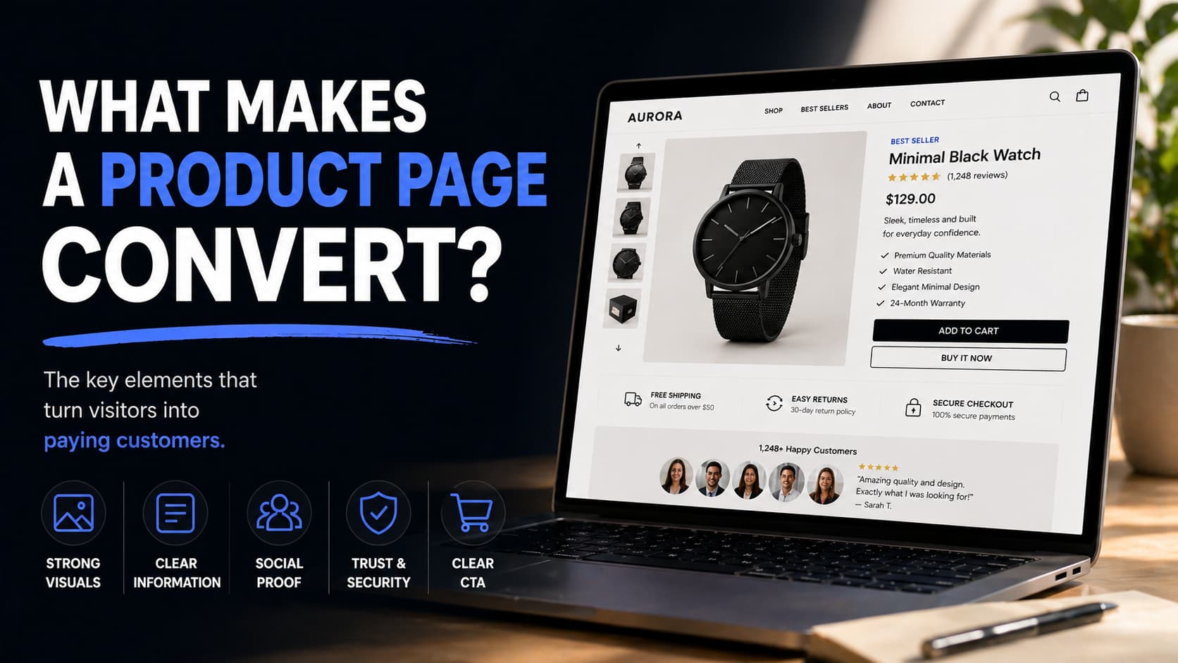
People Don’t Read, They Scan
When visitors land on a product page, they are not reading every word. They are scanning for signals.
They look for quick answers:
- What is this product
- Is it relevant to me
- Can I trust it
- Is it worth the price
If your page does not answer these questions immediately, users lose interest. Strong product pages are structured in a way that makes information easy to absorb at a glance.
Clear headings, clean sections, and a logical flow all help guide the user without forcing them to think.
A Strong First Visual Matters More Than Anything
Before users read anything, they look at the product.
The quality, style, and consistency of your images shape the entire perception of your product. If the visuals feel low-quality or inconsistent, it immediately lowers trust, no matter how good your copy is.
On the other hand, when images feel clean, professional, and aligned, the product instantly feels more valuable.
This is not about having more images. It is about having the right ones:
- clear product shots
- consistent style across variants
- images that show how the product fits into real life
Strong visuals reduce doubt faster than text ever can.
Clarity of the Offer
Visitors should understand exactly what they are buying without effort.
That includes:
- a clear product name
- a simple and direct description
- obvious pricing
- no confusion around variants or options
Trying to be overly clever or creative often hurts conversion. People do not want to interpret your product. They want to understand it instantly.
The best product pages feel simple, even if the product itself is complex.
Social Proof Builds Confidence
Even if everything looks good, users still want reassurance.
Reviews, ratings, and real customer feedback act as validation. They answer the unspoken question: “Has this worked for someone else?”
Strong product pages make social proof visible and easy to access. It should not feel hidden or secondary. It should support the decision naturally as the user scrolls.
Authenticity matters here. Real feedback, even if not perfect, builds more trust than overly polished testimonials.
Removing Friction at Every Step
Conversion is often lost in small moments of hesitation.
Users start asking:
- How long will shipping take
- Can I return this
- Is checkout safe
If these questions are not answered quickly, doubt increases.
High-converting product pages remove this friction by making key information clear and accessible. Shipping details, return policies, and guarantees should feel easy to find and easy to understand.
The goal is to eliminate any reason for the user to pause.
Clear and Confident Call to Action
At some point, the user needs to take action.
If your call to action is weak, unclear, or poorly placed, even interested visitors may not convert.
A strong product page makes the next step obvious. The “Add to Cart” or “Buy Now” button should stand out, feel natural, and appear at the right moment in the flow.
There should be no confusion about what to do next.
Consistency Across the Page
One of the most subtle but powerful factors is consistency.
Everything on the page should feel like it belongs together:
- image style
- typography
- layout
- tone
When everything aligns, the page feels stable and professional. When it does not, something feels off, even if users cannot explain why.
Consistency reduces cognitive load and builds trust at a deeper level.
It’s Not One Element — It’s the Experience
There is no single feature that makes a product page convert.
It is the combination of:
- strong visuals
- clear structure
- trust signals
- smooth user experience
Each part supports the others. When one is missing, the overall experience weakens.
The best product pages do not rely on one trick. They create a seamless experience that makes the decision feel easy.
Conclusion
A high-converting product page is not about adding more elements. It is about removing friction and guiding the user toward a decision.
When everything is clear, consistent, and trustworthy, users do not feel like they are being pushed to buy. They feel comfortable doing so.
That is what conversion really is.
Not persuasion, but confidence.
.jpeg)
.jpg)